With the emerging cultural landscape of big data and conversational buzz around big data analytics, I fell in love with data! There are patterns in almost every activity we carry out, from our eating habits, shopping, Internet usage to how we talk. When we capture these data in a correct format, we can analyze and present the patterns in a way that reveal meaningful details to us.
Whenever we analyze data, our main goal is to show its features in order of their importance, reveal patterns, and features that exist across multiple dimensions. I’ve been learning different Python data analysis tools and frameworks despite the fact that I’m not trained as a data-scientist. My experience while learning how to use some of these tools (Matplotlib, Pandas, NumPy, SciPy, IPython, NLTK & SQLAlchemy) forced me to explore other ways to present the information from the analyzed data.
When it comes to visually presenting analyzed data, I, personally love Plotly even after exploring other libraries like D3.js (which is my second best). Matplotlib is capable of doing more than good, but when you want to stream the results on a website or display analysis on a dashboard, you’ll need an extra effort. Plotly is the answer, it has support for Python, R, MATLAB, JavaScript, Ruby, GO, F#, hardware & embedded systems like Arduino, Julia and an online Streaming API etc
Where is thy data?
So after replacing Gnome with XFCE on my Arch Linux (3 months ago), I realized each time I boot up my Laptop, I had to kill -9 some file tracking applications that degraded the performance on the Laptop because they were trying to index everything on my full hard-disk.
Over a period of time, I could see a lot of kill commands on my history along with the PIDs (Process IDs) and that's how I decided not to automatically do this on .bash_profile. Below is a screen-shot of how the Tracker App is mapped on my Arch Linux instance:
troon: ~/Desktop/Tracker» ps aux | grep tracker

I cleaned this data and saved it on a CSV file. Let us visualize which PIDs are commonly used after several reboots. Here is a snip of the raw data (history id, kill -9 command and the Tracker PID). I was interested on the saved Tracker PIDs only.
troon: ~/Desktop/Tracker» history | grep 'kill -9' > trackerPIDs.txt
troon:~/Desktop/Tracker» head trackerPIDs.txt
   66  kill -9 17323
  181  kill -9 3410
  182  kill -9 3346
  183  kill -9 3330
  292  kill -9 9100
 1125  kill -9 24279
 1128  kill -9 25098
 1604  kill -9 593
 1635  kill -9 603
 1636  kill -9 606
After cleaning the data on trackerPIDS.txt and saving it on a different file in CSV format, cleanedTracks.csv. Each row on the final file contains five PIDs (in the following order):
- /usr/lib/tracker/tracker-miner-user-guides
- /usr/lib/tracker/tracker-miner-apps
- /usr/lib/tracker/tracker-store
- /usr/lib/tracker/tracker-miner-fs
- /usr/lib/tracker/tracker-miner-extract
The CSV file with the cleaned data finally looks like this:
troon:~/Desktop/Tracker» head cleanedTracks.csv
627,628,629,608,610
613,620,623,791,793
605,608,617,618,604
715,603,607,614,615
616,605,609,610,618
621,590,594,598,605
608,602,604,612,616
627,630,640,643,644
775,777,784,785,786
692,694,702,703,704
If you’d wish to check on the data used and all other files related to this post, check out https://github.com/JohnTroony/Plotly-DataVis .
Using Plotly to visualize the data.
Using Plotly to visualize data is as easy as making pancakes on a weekend. First, I had to install Plotly (for Python) pip install Plotly. Below is a script I wrote to open the CSV file, fill empty lists with data from the file and feed them to Plotly.
from Plotly.offline import plot
import Plotly.graph_objs as go
import csv as csv

# Open the CSV file with data
readdata = csv.reader(open("cleanedTracks.csv"))

# Create empty lists for the data
miner_user_guides = []
miner_apps = []
store = []
miner_fs = []
extract =[]

# For every line in the CSV file, append respective list
for line in readdata:
    miner_user_guides.append(line[0])
    miner_apps.append(line[1])
    store.append(line[2])
    miner_fs.append(line[3])
    extract.append(line[4])


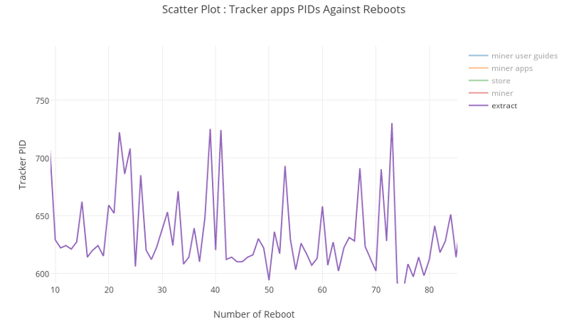
############# Scatter Plot

# map our data (in lists) to a Scatter plot
miner_user_guidesPlot = go.Scatter(y = miner_user_guides, opacity = 0.95, name = "miner user guides")
miner_appsPlot = go.Scatter(y = miner_apps, opacity = 0.95, name = "miner apps")
storePlot = go.Scatter(y = store, opacity = 0.95, name = "store")
miner_fsPlot = go.Scatter(y = miner_fs, opacity = 0.95, name = "miner")
extractPlot = go.Scatter(y = extract, opacity = 0.95, name = "extract")

# data to be plotted
data = [miner_user_guidesPlot, miner_appsPlot, storePlot, miner_fsPlot, extractPlot]
layout = go.Layout(
    title='Tracker Apps PIDs Against Reboots',
    xaxis=dict(
        title='Number of Reboot',
        titlefont=dict(
            family='Courier New, monospace',
            size=18,
            color='#7f7f7f'
        )
    ),
    yaxis=dict(
        title='Tracker PID',
        titlefont=dict(
            family='Courier New, monospace',
            size=18,
            color='#7f7f7f'
        )
    )
)

# Combine data and plot
fig = go.Figure(data = data, layout = layout)
plot(fig, filename = 'tracker-scatter.html')

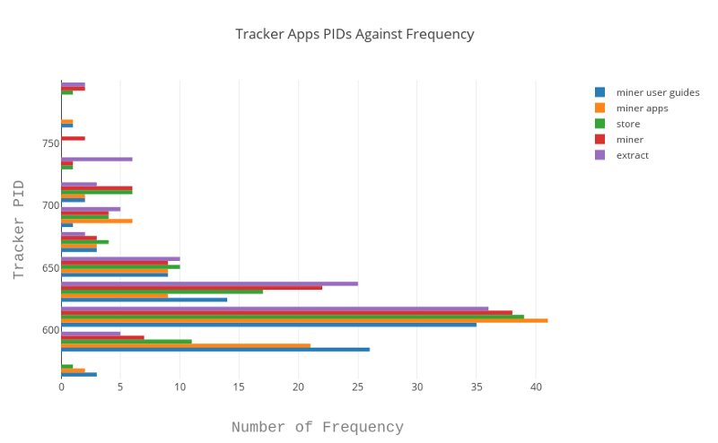
############# Histogram Plot

# map our data (in lists) to a Histogram plot
miner_user_guidesPlot = go.Histogram(y = miner_user_guides, opacity = 0.95, name = "miner user guides")
miner_appsPlot = go.Histogram(y = miner_apps, opacity = 0.95, name = "miner apps")
storePlot = go.Histogram(y = store, opacity = 0.95, name = "store")
miner_fsPlot = go.Histogram(y = miner_fs, opacity = 0.95, name = "miner")
extractPlot = go.Histogram(y = extract, opacity = 0.95, name = "extract")

# data to be plotted
data = [miner_user_guidesPlot, miner_appsPlot, storePlot, miner_fsPlot, extractPlot]
layout = go.Layout(
    title='Tracker Apps PIDs Against Frequency',
    xaxis=dict(
        title='Number of Frequency',
        titlefont=dict(
            family='Courier New, monospace',
            size=18,
            color='#7f7f7f'
        )
    ),
    yaxis=dict(
        title='Tracker PID',
        titlefont=dict(
            family='Courier New, monospace',
            size=18,
            color='#7f7f7f'
        )
    )
)


# Combine data and plot
fig = go.Figure(data = data, layout = layout)
plot(fig, filename = 'tracker-histogram.html')
You can download the script here : https://gist.github.com/JohnTroony/1d938afa6121915b62a2
When this script is executed, two files are generated (and opened on your default browser):
Scatter Plot

Histogram Plot

Cool Stuff about Plotly….

- You can save the plotted graph as a PNG/JPG file.
- You can as well save your plotted graphs on your online
account (Public/Private). - Zooming at a particular area on the graph is easy (crop the section you want to zoom).
- You can pan, auto-scale, zoom-in, zoom-out, reset axes and show data on hover.
- Compare data on hover.
- Edit chart on the fly.
- Embed the graph as an iframe or html.
- Finally, the sweetest part, if you have multiple data sets, you can select to view a particular set only without the rest (like on
d3.js)
Go try it out!
For more Plotly examples, guides & documentation, please visit https://plot.ly/api/ or https://github.com/Plotly.
For more meaningful data to play around with, visit :
- Great Github list of public data sets.
- Or, for guys in Kenya, Opendata.
- https://www.opendata.go.ke/.
